What Is a Low-Fidelity vs High-Fidelity Mockup in UX: A Designer’s Honest Guide
So you’ve got a brilliant idea. Maybe it’s an app, a landing page, or a whole digital product. The question is: how do you show people what’s in your head before a single line of code is written? That’s where Mockup design enters the picture and understanding the difference between low-fidelity and high-fidelity versions might just be the skill that transforms your workflow.
Starting From Scratch: What Even Is Fidelity?
In UX design, “fidelity” refers to how closely a prototype or visual representation resembles the final product. Think of it like a sketch versus a photograph. Both capture a face, but one tells you far more about the subject than the other.
Low-fidelity and high-fidelity mockups sit at opposite ends of this spectrum — and each has a specific role to play in the design process. Neither is superior. They’re tools, and like any tool, their value depends entirely on when and how you use them.
Low-Fidelity Mockups: Thinking Out Loud
Low-fidelity (lo-fi) mockups are rough, fast, and intentionally simple. We’re talking about wireframes, hand-drawn sketches on paper, or basic grayscale digital layouts with placeholder boxes and squiggly lines standing in for text.
Their superpower? Speed. You can produce a dozen layout variations in an afternoon. There’s no attachment to color schemes or typography choices — just pure structural thinking.
When lo-fi mockups shine:
- Early brainstorming sessions where the concept is still fluid
- Team discussions where ideas need to change quickly based on feedback
- User testing focused on navigation flow rather than aesthetics
- Presenting rough concepts to stakeholders before any investment is made
The raw, unpolished look of lo-fi designs actually has a psychological advantage: people feel comfortable giving critical feedback. There’s nothing precious about a box labeled “IMAGE GOES HERE.”
High-Fidelity Mockups: Getting Real
High-fidelity (hi-fi) mockups are a completely different animal. These are pixel-perfect, visually complete representations of a product — real fonts, actual brand colors, detailed UI components, and realistic content. Looking at a hi-fi mockup feels almost like looking at the finished product.
This is where design intent becomes tangible. A developer can look at a hi-fi mockup and understand exactly what needs to be built. A client can experience the brand personality. A stakeholder can finally see the vision, not just imagine it.
Hi-fi mockups require more time and skill, but the investment pays off in the later stages of a project when precision matters more than speed.
Real-World Use: Mockups in Practice
Let’s leave theory behind for a moment and look at how real teams use these tools.
Product startup launching a mobile app: The team begins with lo-fi sketches to map user journeys. Once the navigation structure is validated through quick user tests, they move into hi-fi mockups to nail down visual identity before handing off to developers.
E-commerce brand redesign: Designers use lo-fi wireframes to restructure the product page layout based on analytics data. High-fidelity mockups are then presented to the marketing team, showing how the new design integrates with seasonal campaign visuals.
Freelance web designer pitching a client: Rather than building a full prototype, they present a hi-fi mockup of the homepage inside a realistic device frame — a laptop on a clean desk, rendered beautifully. The client sees not just the design but how it exists in the real world.
That last example reveals something important: context matters enormously. Showing a design inside a realistic scene creates emotional connection that a flat artboard simply cannot.
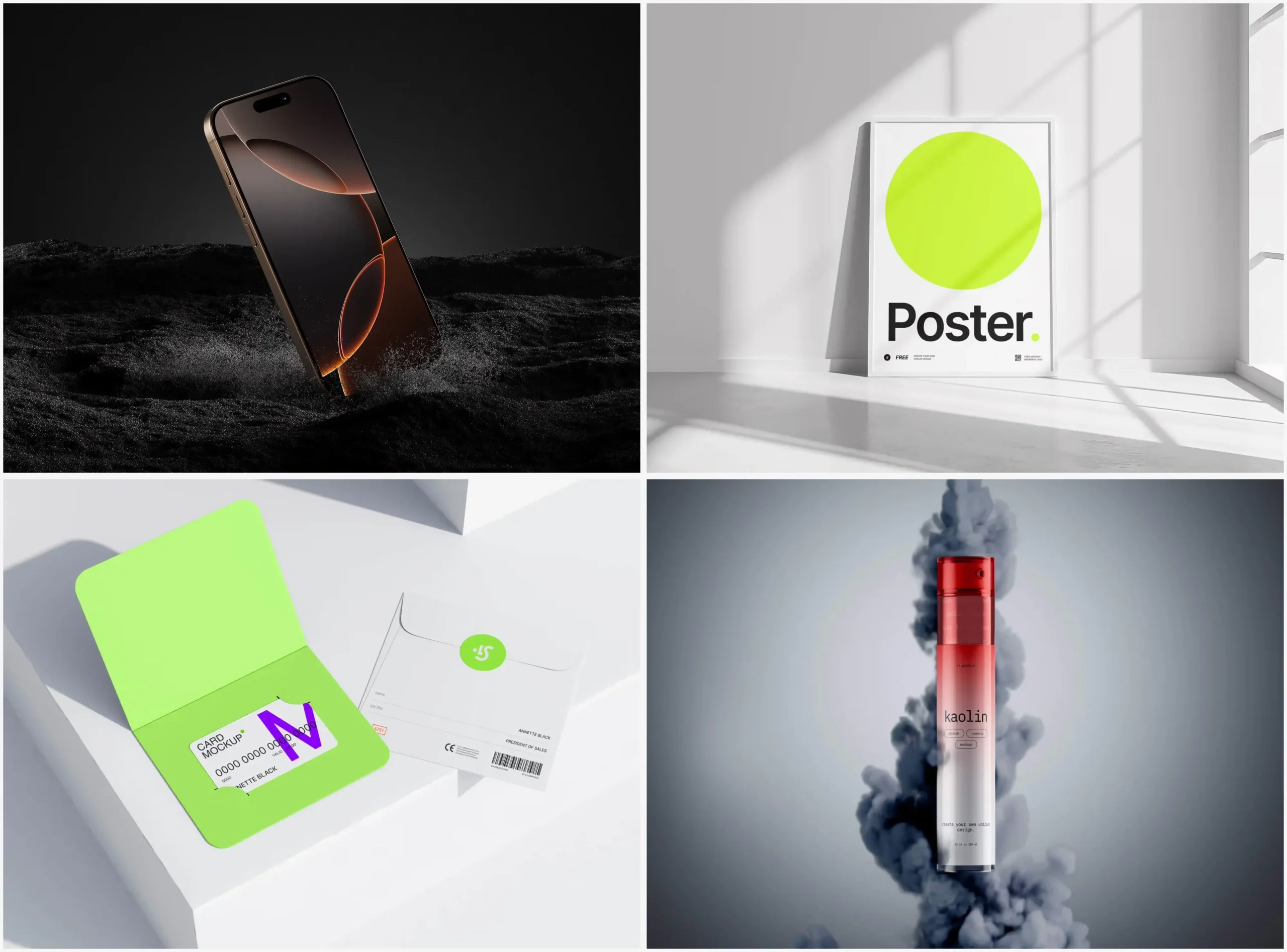
Mockups at ls.graphics: A Resource Worth Knowing
When it comes to sourcing high-quality mockup assets, ls.graphics has built a serious reputation among professional designers. And it’s not hard to see why — the library is packed with features that make it genuinely useful rather than just visually impressive:
- Ultra-realistic rendering with precise lighting, shadows, and reflections that make your designs look authentically three-dimensional
- Organized, clearly labeled layers so dropping in your artwork takes seconds, not a frustrating afternoon
- Multiple angles and perspectives for each product, giving you the flexibility to find the shot that fits your composition
- Various color styles per scene, making it easy to match your brand environment or client’s palette
- Stylish minimalist compositions with that clean editorial feel that elevates any portfolio or presentation
- Edit Online feature — place your design directly into a scene without opening any software, perfect for quick previews or last-minute client requests
- A large collection of free scenes to explore before committing, offering premium quality at zero cost — a genuinely rare combination
Whether you’re a freelancer putting together a pitch or a studio designer preparing handoff assets, having a reliable mockup library in your toolkit changes the way clients and stakeholders experience your work.
Conclusion
The lo-fi versus hi-fi debate isn’t really a debate at all. They serve different moments in the creative process, and the best designers know instinctively when to reach for each one. Start rough. Think fast. Then, when the structure feels right, invest in high-fidelity detail that communicates your vision with precision and polish.
And when you’re ready to present that polished work in a way that truly impresses — whether to a client, a team, or the internet — a great mockup scene makes all the difference. Resources like ls.graphics exist precisely for that moment, when your design deserves to be seen at its absolute best.